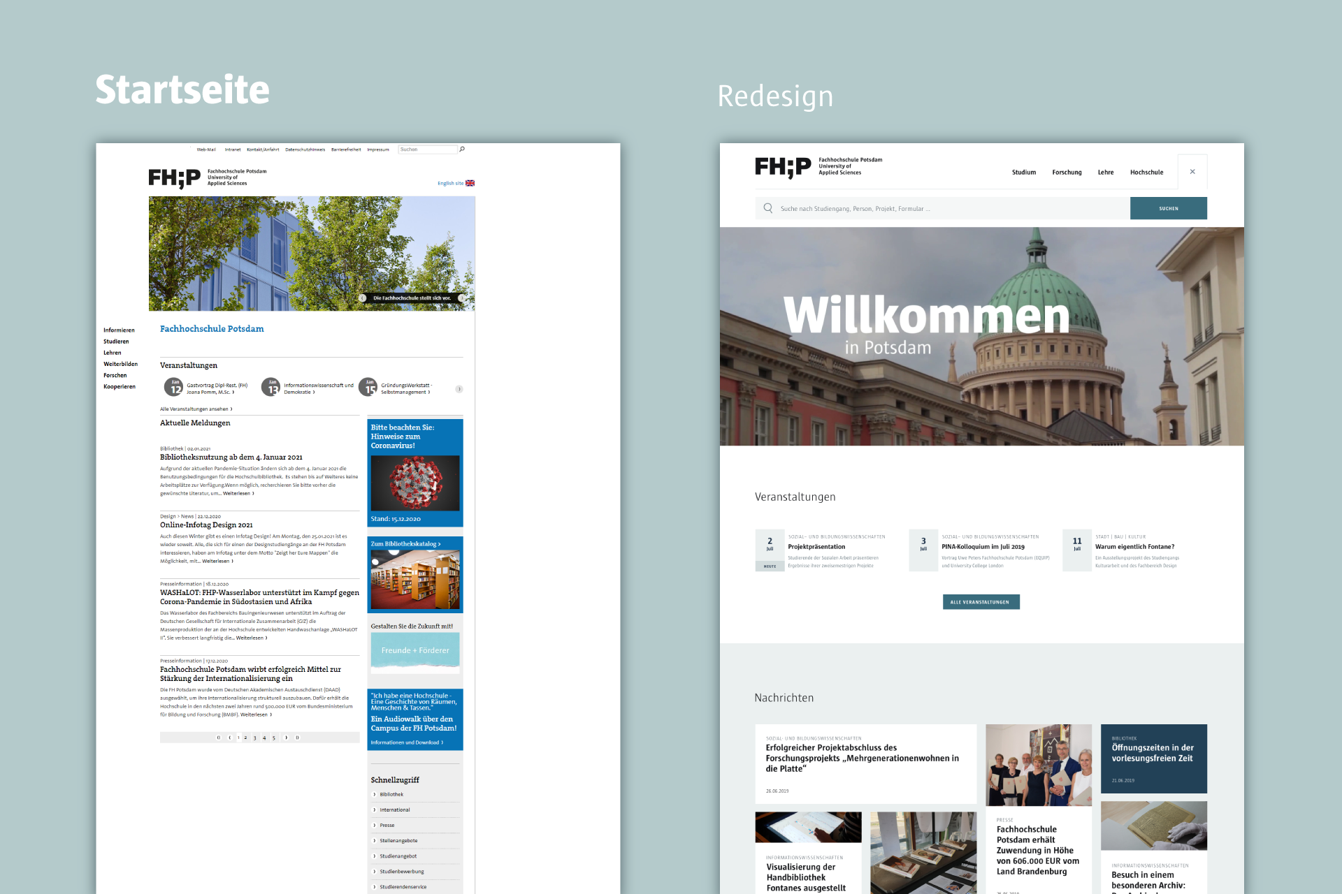
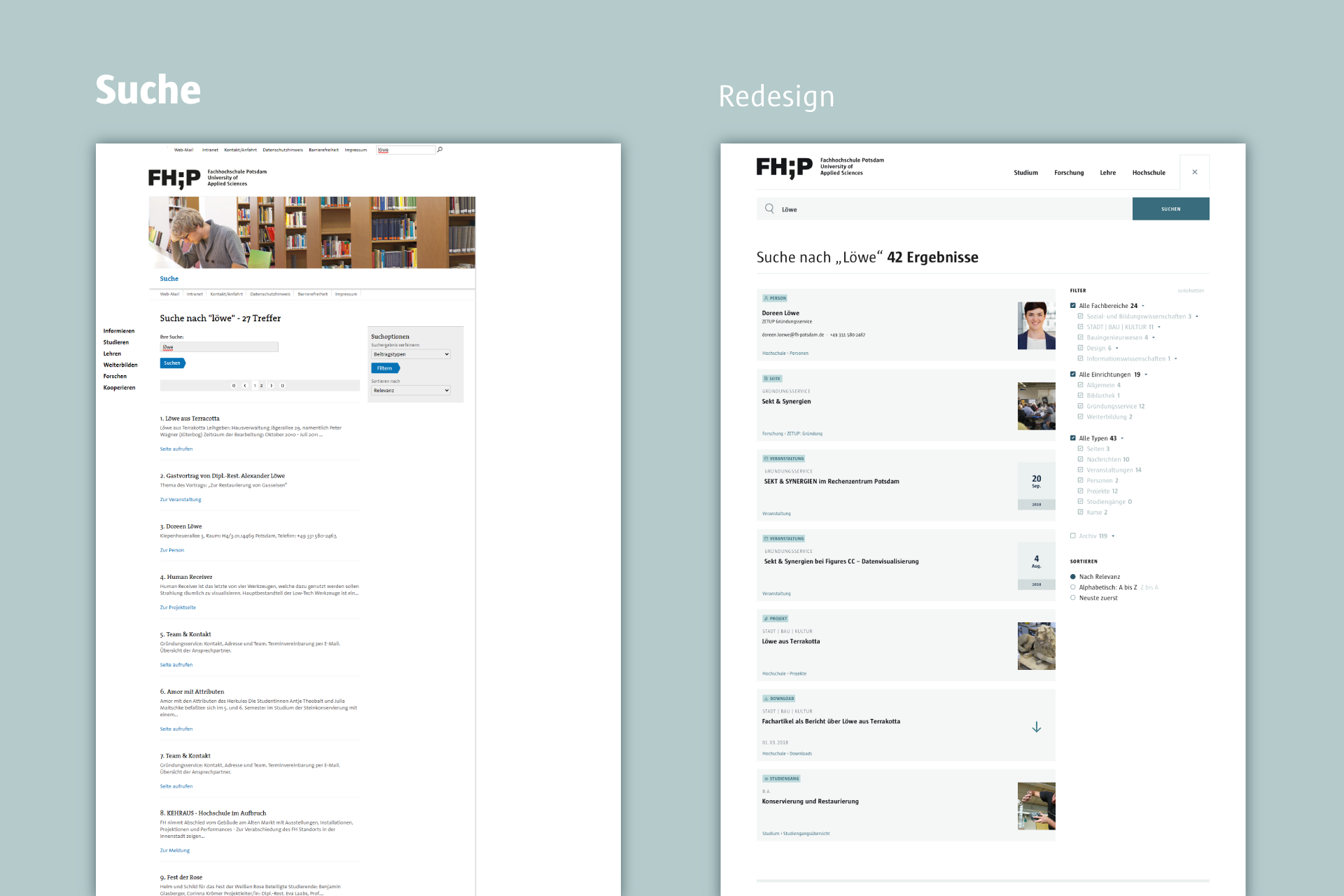
It’s 1997 and the IT department of the University of Applied Sciences Potsdam publishes its first website. Over the following years, the University grows and flourishes with more students and courses. This is accompanied by more content, more contributions, more people and a chaotic system of hundreds of sub-pages. Applicants, professors, students, researchers – everyone wants to be understood. In the process, the big picture is lost from sight. 22 years later, 14 students in a UX seminar set out to bring order to the chaos. A website redesign.
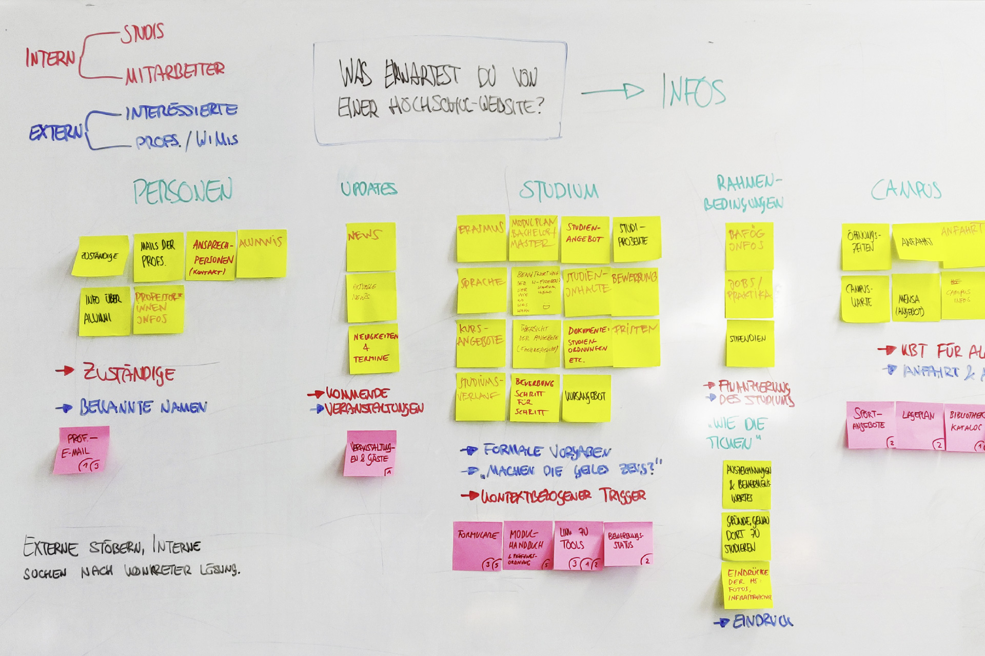
The analysis of the existing website and the target groups took place together. After that, the groups separated and produced four different concept and design drafts with the help of the insights we had gathered together. During that time we still worked together as a group and gave each other regular feedback.
Analysis & target groups
One of the first steps in the analysis was to break down the current information structure of the main navigation. In order to have a comparison to other institutes, a competitor analysis was also made and the websites of other universities were analysed. At the same time, a large number of examinees on campus were asked about their experience with the university website during their qualifying examination at the Department of Design.
Two target groups were defined: internal and external visitors. Internal visitors are university members who know their way around and know what they are looking for. External visitors, on the other hand, want to get an impression of the university; they are not helped by a quick search, because they do not know what they are looking for.
Information architecture
The current FH website attempts to divide the content into six main categories/actions: Information, studies, teaching, training, research and cooperation. These categories are further divided into up to four sub-levels. Things get even trickier if the desired content cannot be clearly assigned to a category, if pages are found in several categories or if the same content appears in several pages.
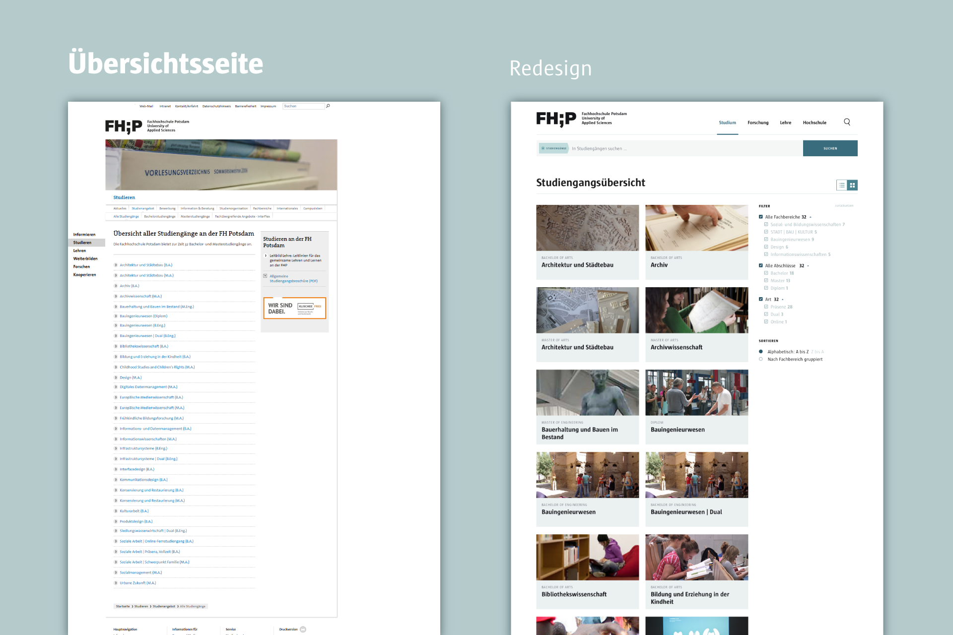
First, we reorganised all the top pages. Then we defined four new main categories: studies, research, teaching and universityAll pages can be found under these categories; there are no further levels. Instead, they are only grouped, which helps to avoid a confusing and deep structure. With one click on the main category, visitors can see all sub-pages at once.
Data types & filters
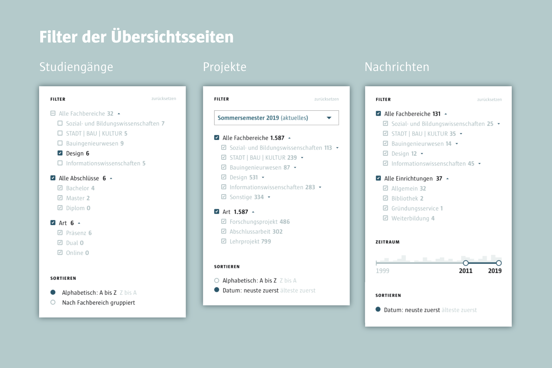
We defined ten data types: News, events, people, projects, downloads, jobs and internships, study programmes, courses, workshops & labs and rooms. Each data type has its own overview page. When users call up these overviews, they see all the existing data. The data displayed can then be reduced or sorted using filters.
Style guide
When choosing the colours, we aimed to stay close to the corporate design of the UAS Potsdam. In order to create a better colour harmony with the images used on the website, we used the surrounding colours of the main building as colour inspiration. This includes blue and blue-green tones caused by the reflections in the glass of the buildings. For the typeface, we used the official font of the University: FHP Sun by LucasFonts.
