The Brandenburg Student’s Union is the association of student unions from Brandenburg’s universities. Its State Conference is anchored in the Brandenburg Higher Education Act. The aim of the BRANDSTUVE is to coordinate the interests of the students and their student bodies and to represent them effectively.
The BRANDSTUVE had been inactive for years. One of the first tasks of the newly elected Speakers’ Council in 2018 was to reactivate the internal structures. Regular conferences and a new internal platform for networking and collaboration were crucial for this. After a successful start and with well-functioning structures, it was now time to take a look at the branding, as the old brand image was no longer up to date.
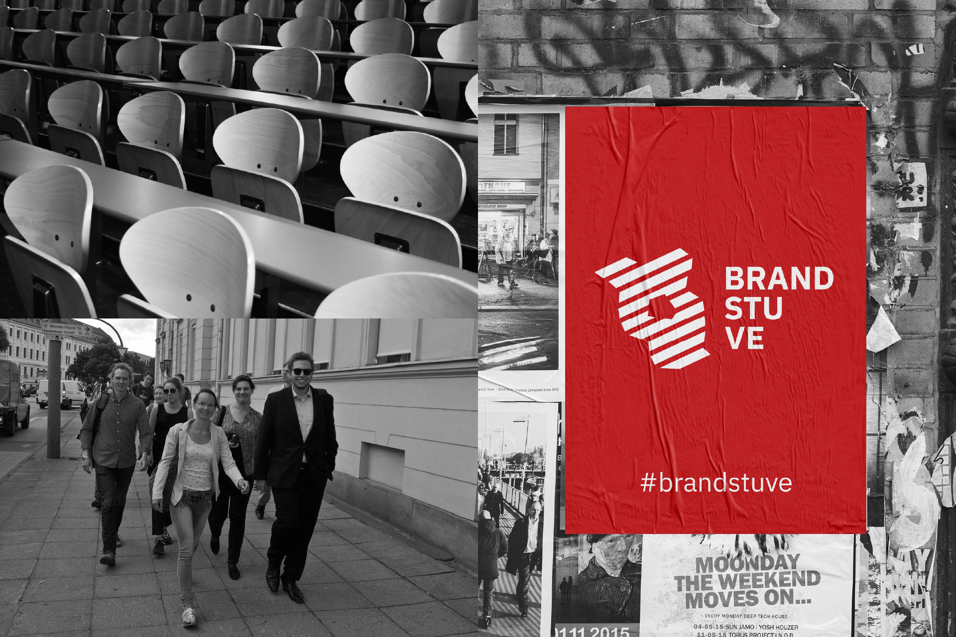
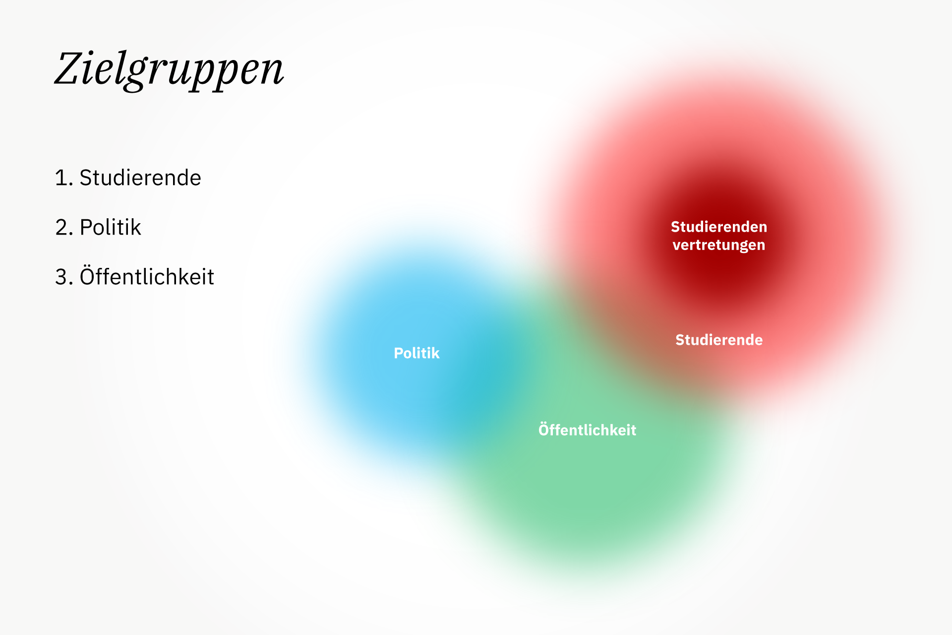
The new brand identity was to replace the outdated brand image and adapt it to the new requirements. The profile of the BRANDSTUVE was defined in open workshops with representatives from various universities. Several variants were then developed, and in the end the universities chose their favourite. The result is an identity that reflects a strong, competent and well-connected state student union. This identity includes clearly defined target groups, a new logo, a colour palette, imagery and a characteristic typography.
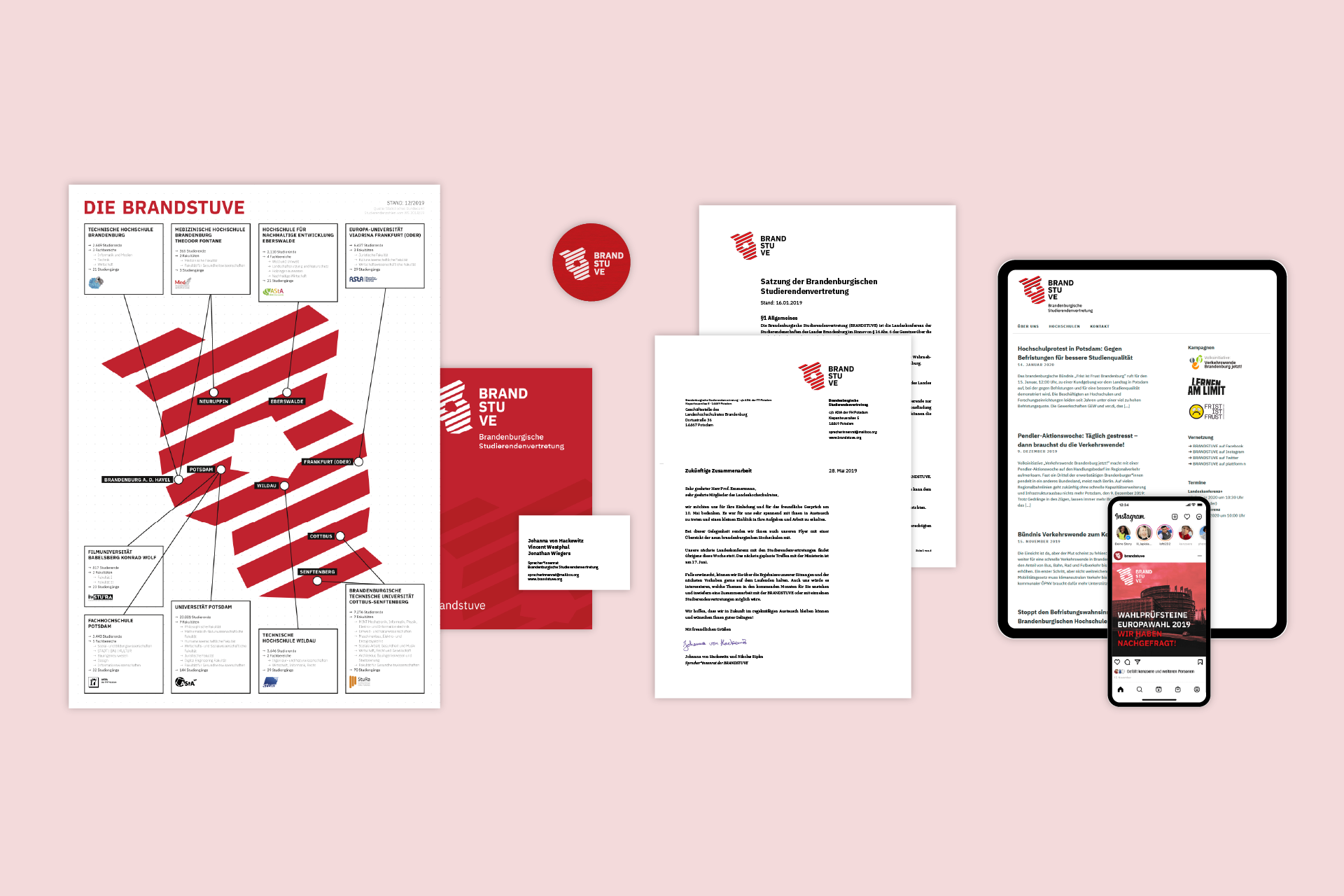
For the launch of the new identity, a fold-out flyer with general information about the BRANDSTUVE was designed. It introduces the union and shows a map with an overview of the Brandenburg universities. The website, the internal platform and the social media accounts were also updated. New templates were created for letters, statutes, protocols, forms and slides. For public events, wooden buttons with the BRANDSTUVE logo and business cards were designed for the Speaker’s Council.


